Re-imagining a digital loyalty experience at British Gas
Product design, product strategy, stakeholder management, user testing, team buildingMeeting the team
Before our newly formed loyalty scrum team was ready to get started I wanted to first take some time to get to know them.
I took the team out of the hustle and bustle in London and down to the relaxed seaside office at Clearleft in Brighton. The objective of this team building offsite was to first and foremost build trust with one another which would be crucial for our working relationship in the near future. I kicked off the day with a 'fears and vulnerabilities' excercise where each team member (if they feel comfortable doing so) reveals something personal that they've struggled with in life. You sit, listen and begin to understand who these people are.
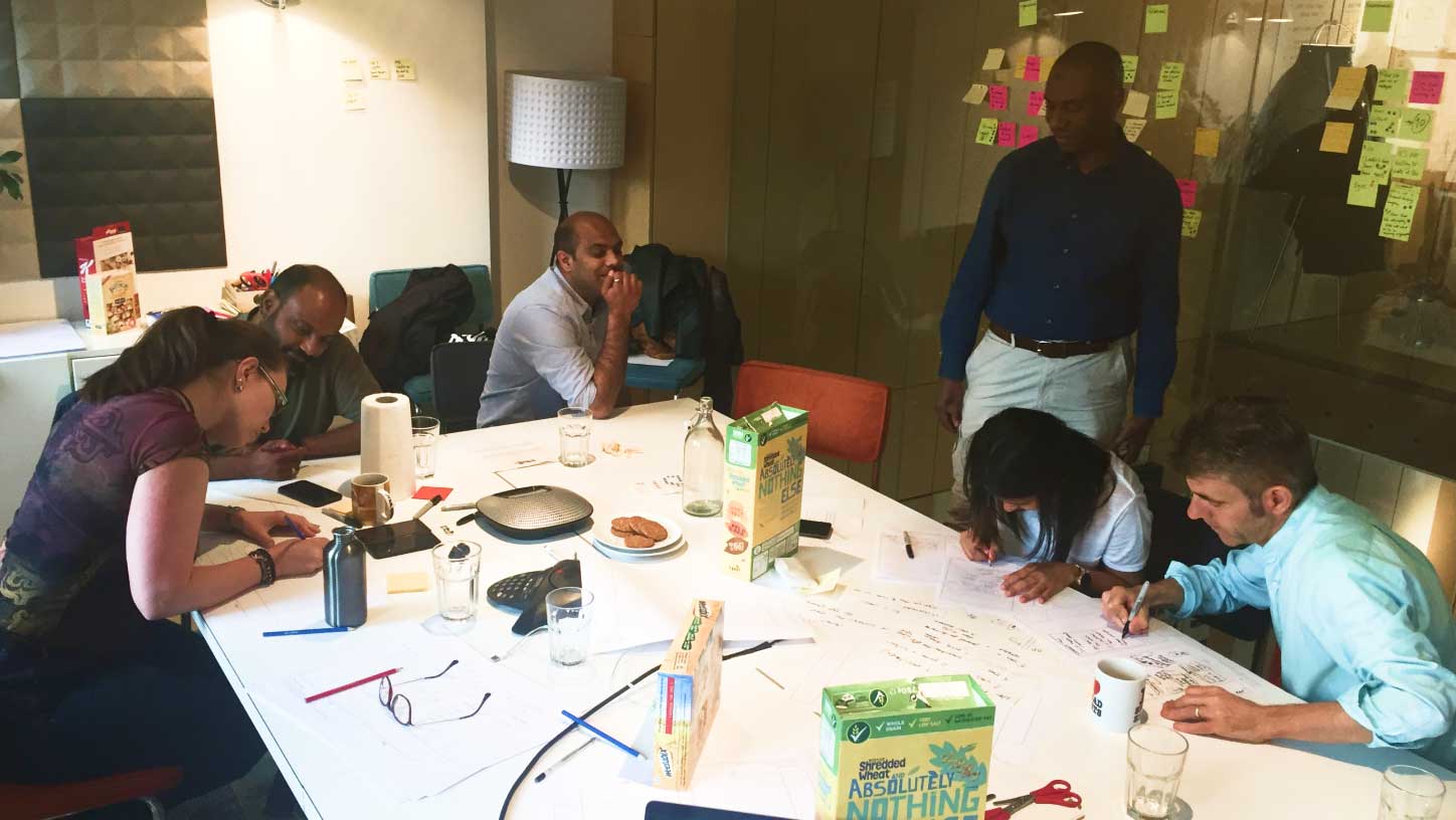
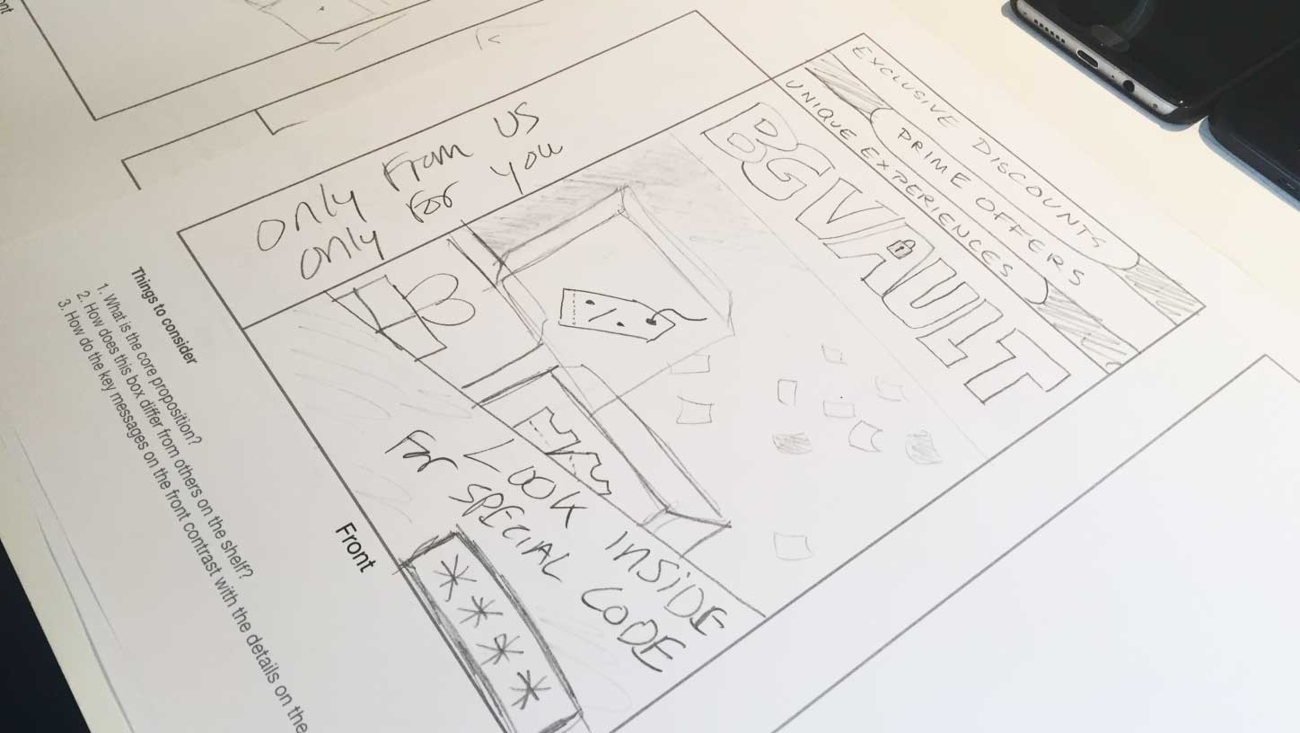
Next, I facilitated a 'design the box' excercise where the team break up into small groups and design a cereal box they feel represents the product we're (going to be) working on. It's a fun and collaborative way to get people thinking strategically and creatively.
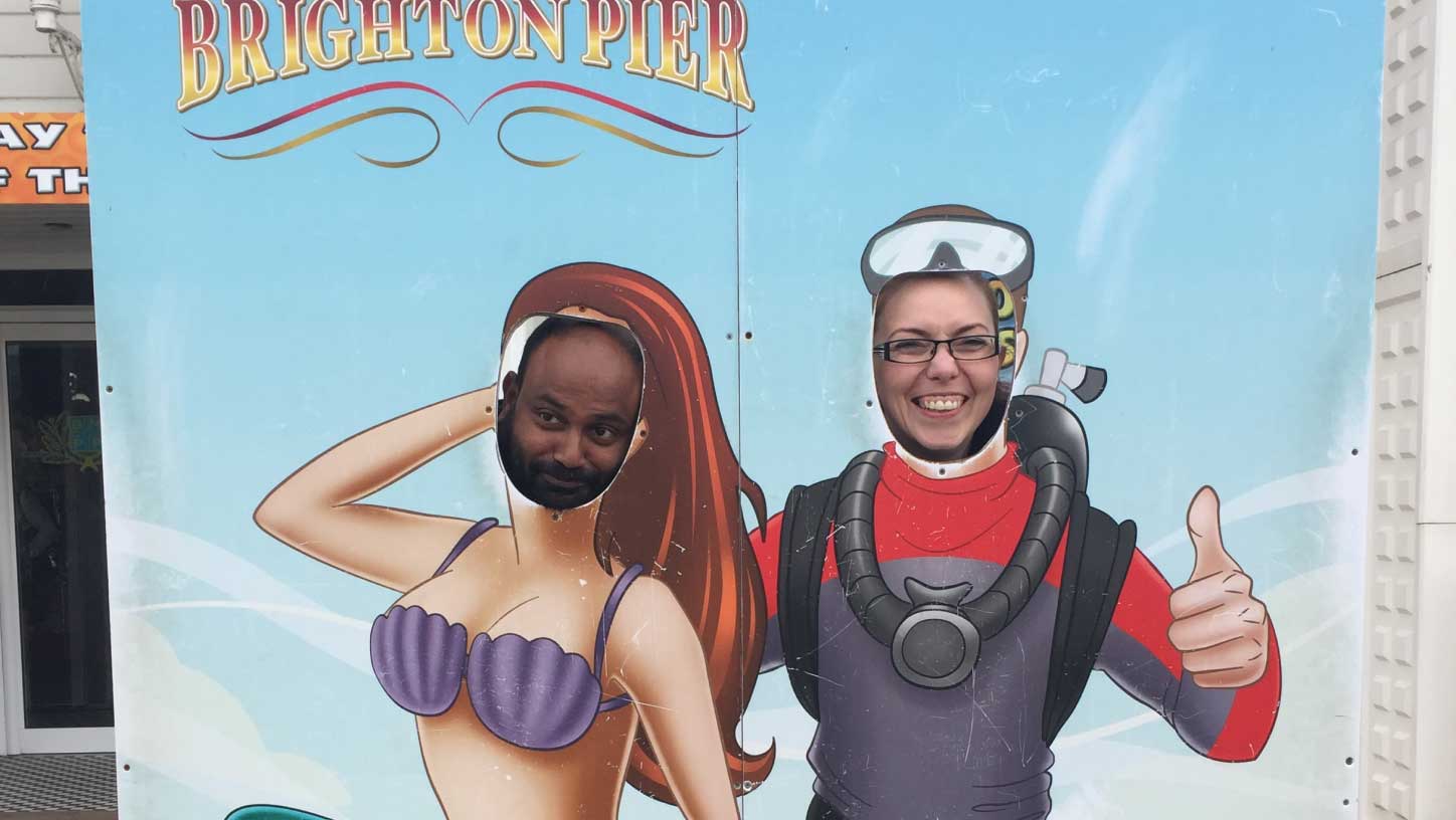
To finish ... well what is a trip to Brighton without a visit to the pier!?
Identifying pain points
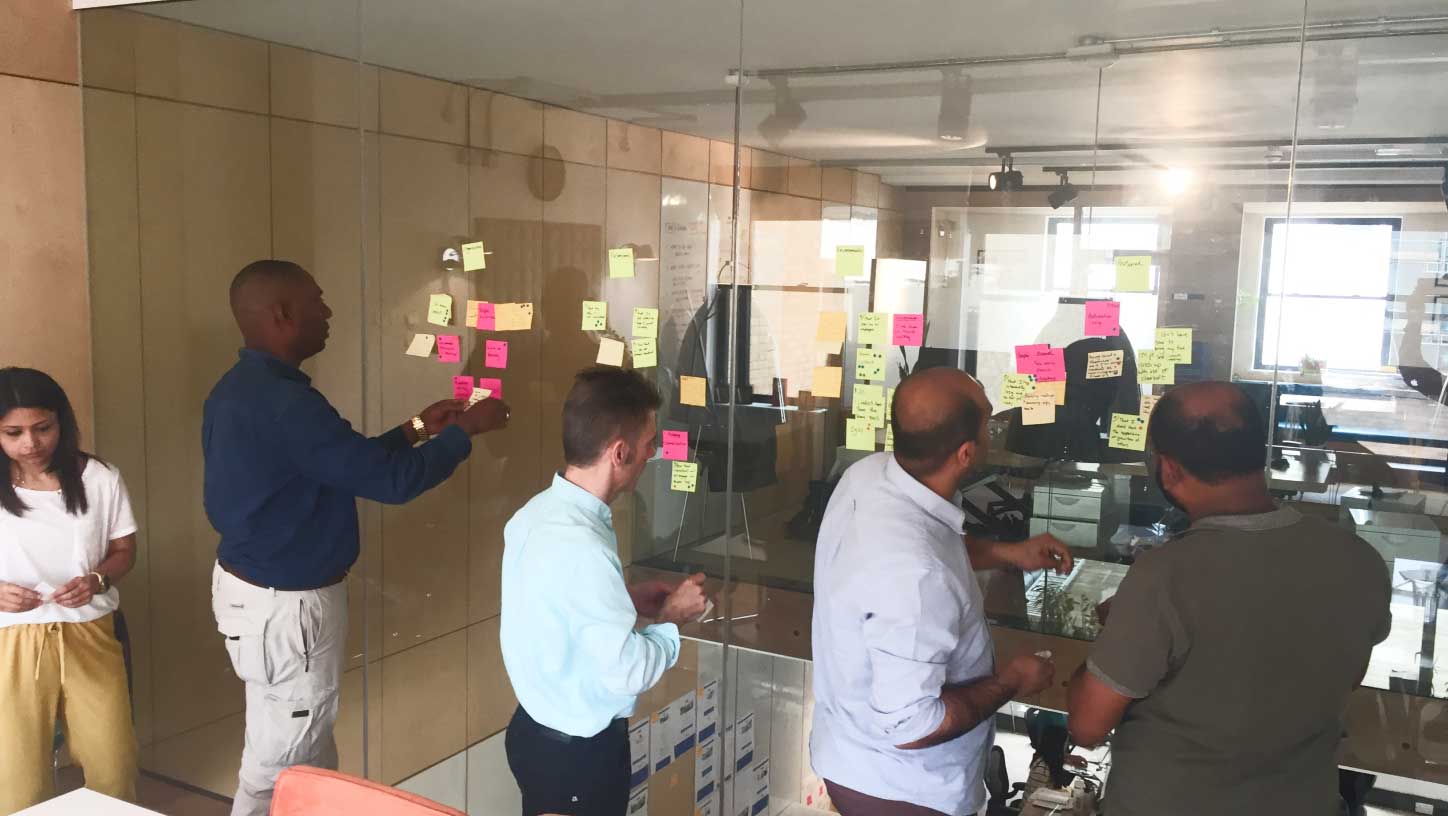
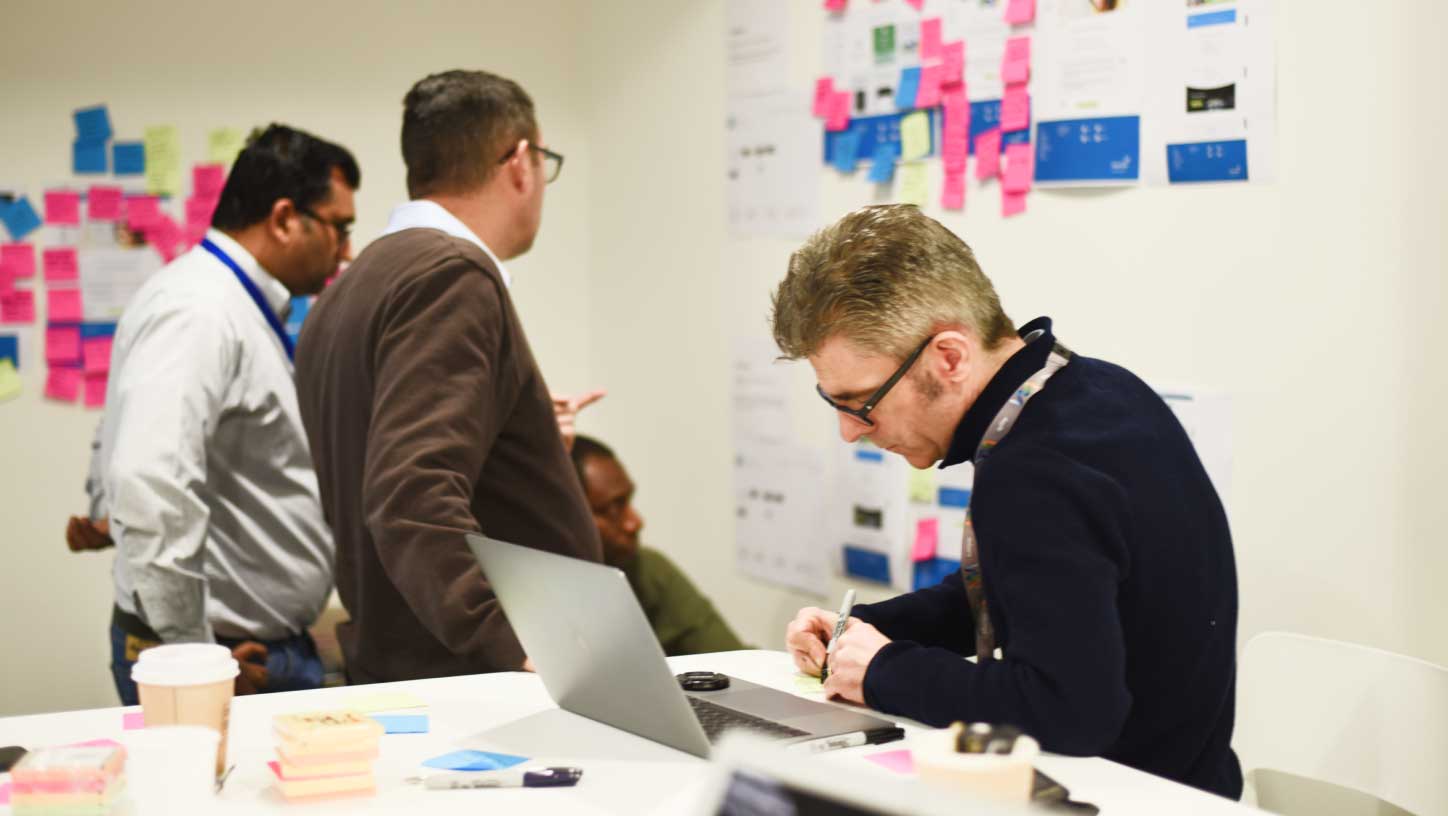
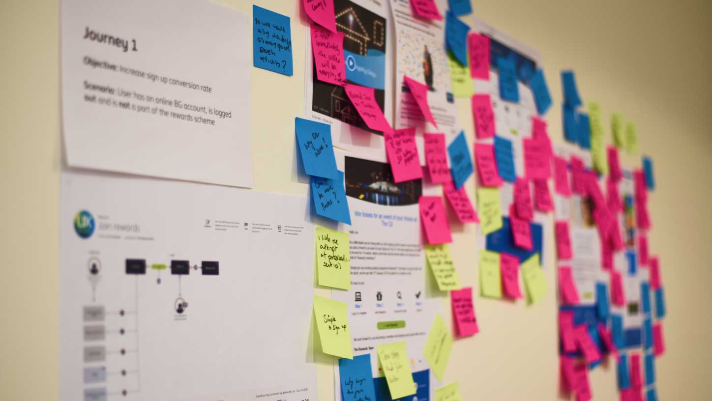
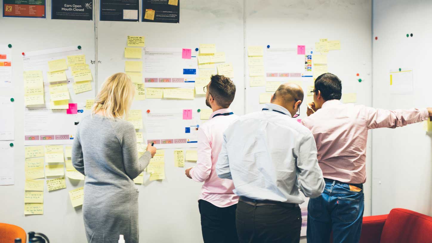
Now we were ready to get down to business. To begin with we needed to understand our product space thoroughly and to do this I facilitated a workshop where we documented every possible customer pain point through the golden path of our loyalty journey.
Once we had a wall covered in post it notes we grouped each of these pain points into themes which made our findings easier to communicate to external stakeholders and to better determine which areas we needed to prioritise.
Ideation
After establishing where our customers are struggling it was time to generate some ideas that might solve these problems.
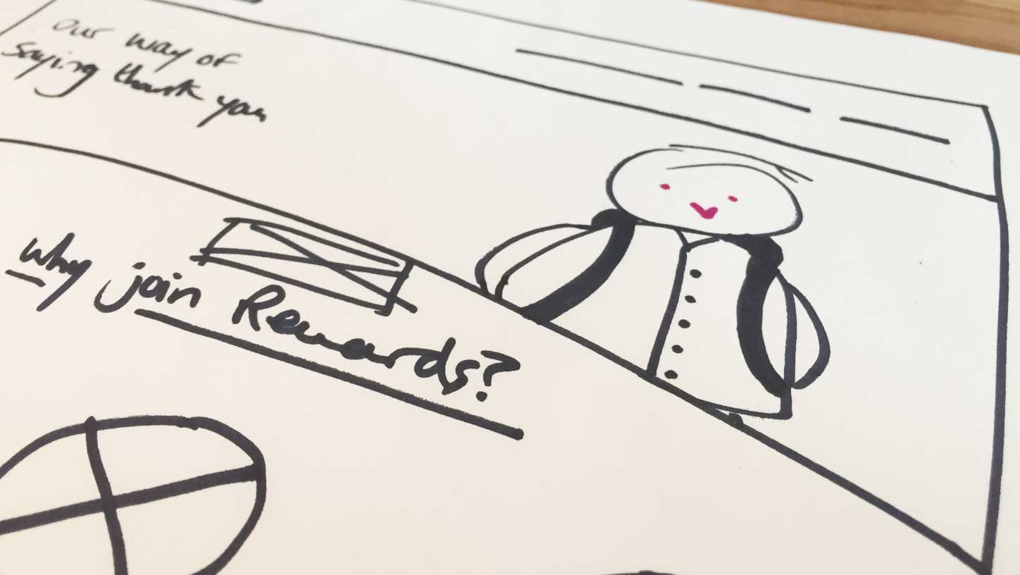
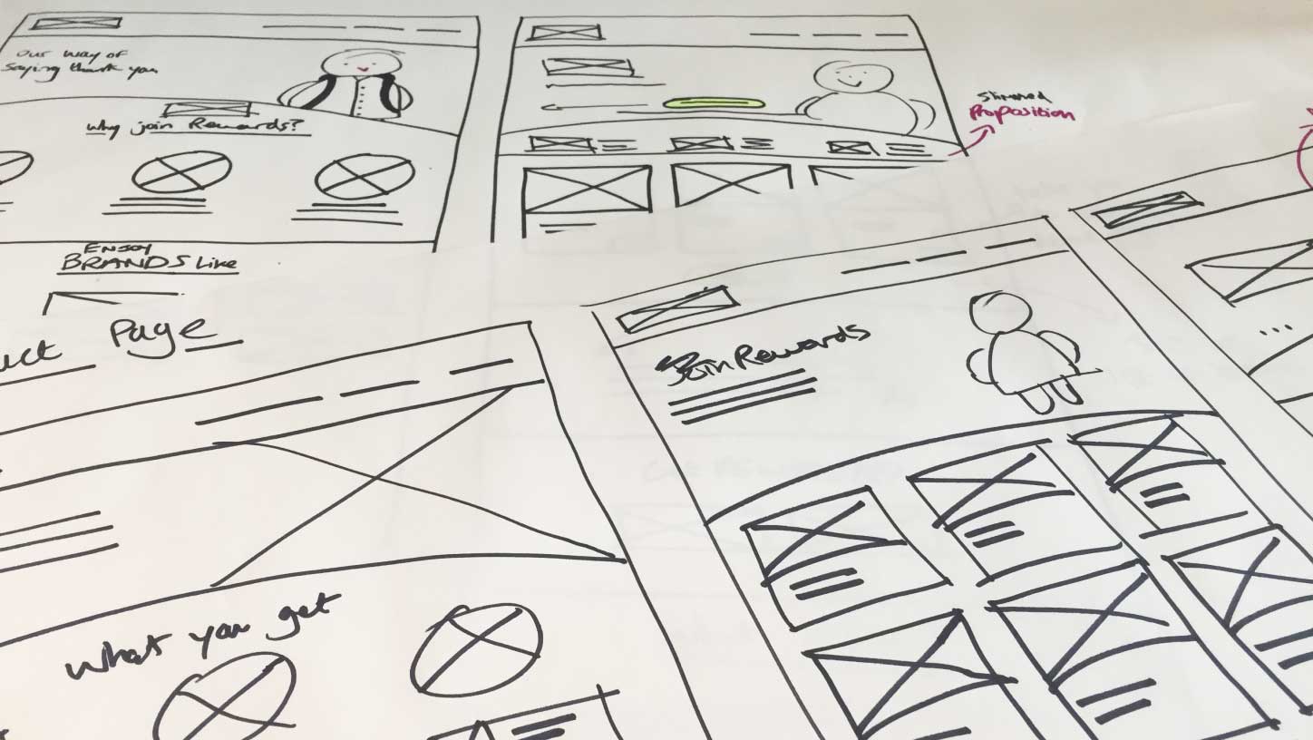
I created a number of designs that I felt could help boost our customer engagement including the combination of several pages in order to reduce the length of the user journey, better communicating the proposition to help customers understand what they're getting upfront and to make better use of the program's mascot, Wilbur, in order to add some delight and fun to the user's experience.
To ideate through as many ideas as possible I kept the fidelity low with an eye on adding more polish much later down the line once these ideas had been validated through user testing.
Validating our ideas
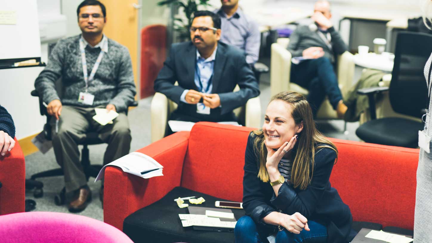
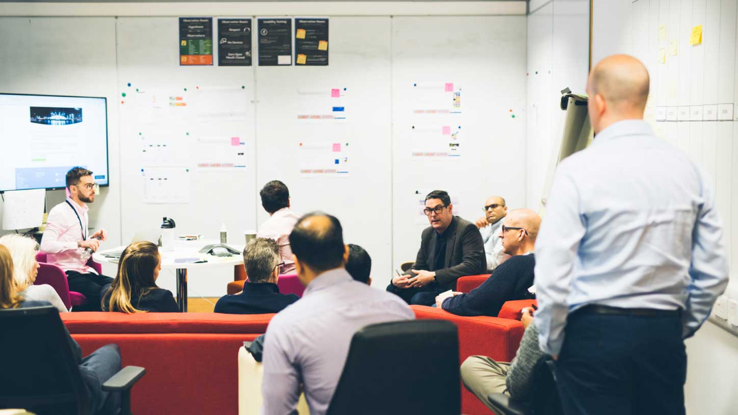
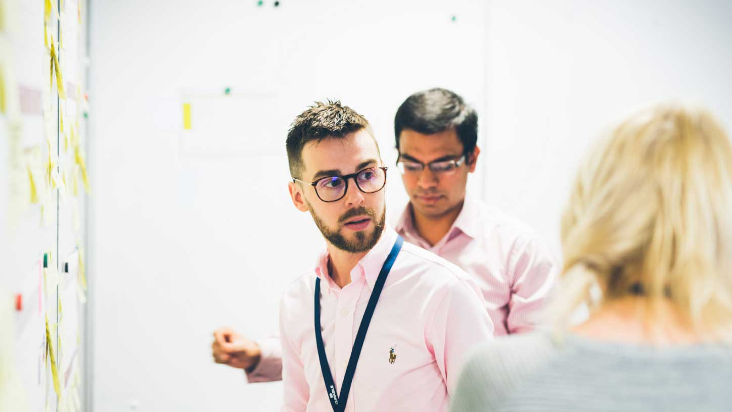
Using British Gas's onsite user testing labs I faciliated two days worth of 1-1 interviews with two sets of customers. One group were existing loyalty scheme members and the other group were existing British Gas customers but had not yet joined our loyalty scheme. I used these days of user testing as an opportunity to invite relevant stakeholders from around the business to see our work, contribute and feel a sense of ownership over what we were trying to achieve.
Bringing the ideas to life
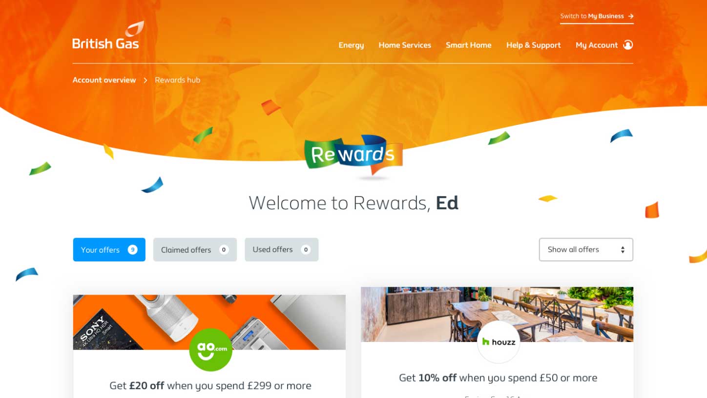
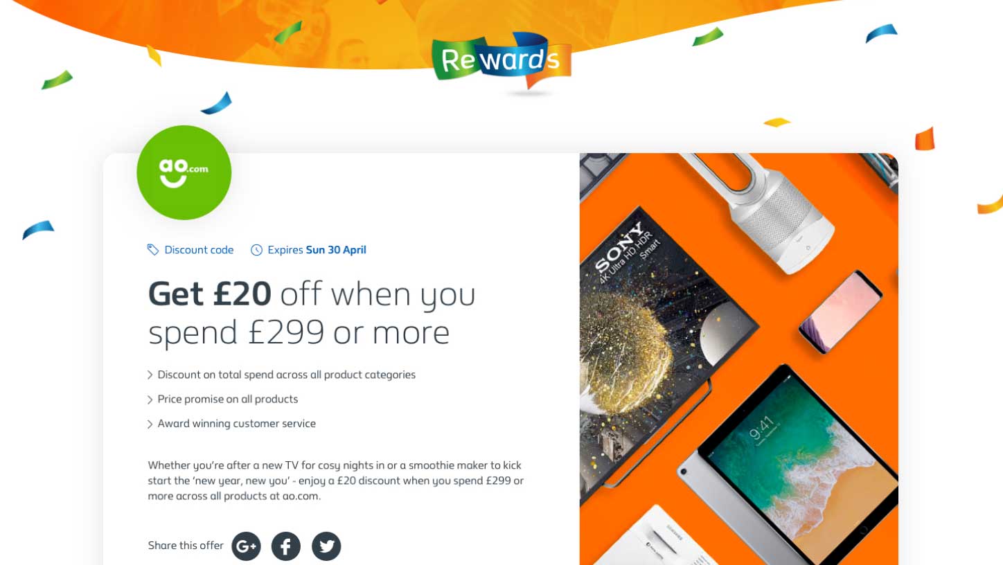
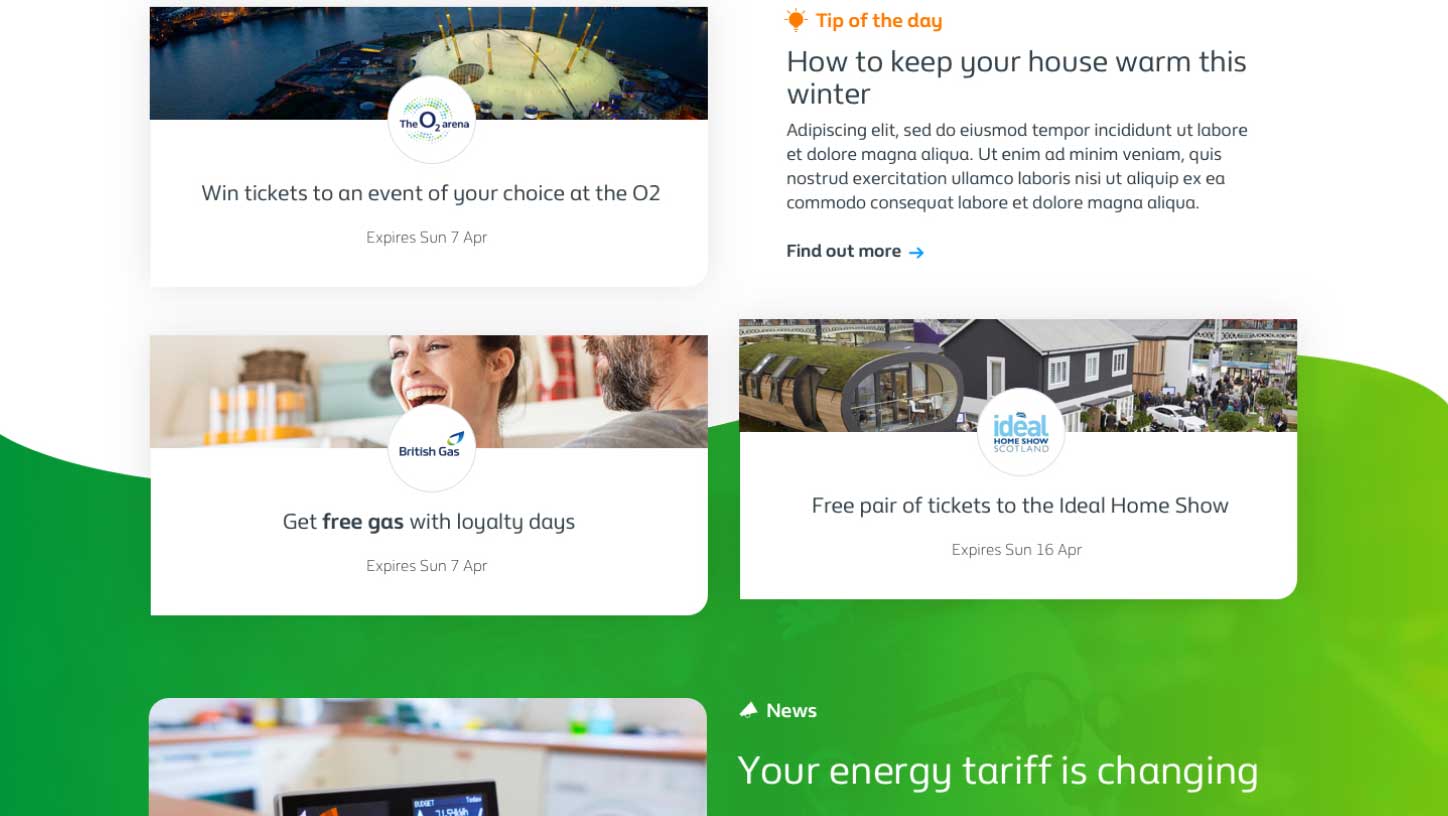
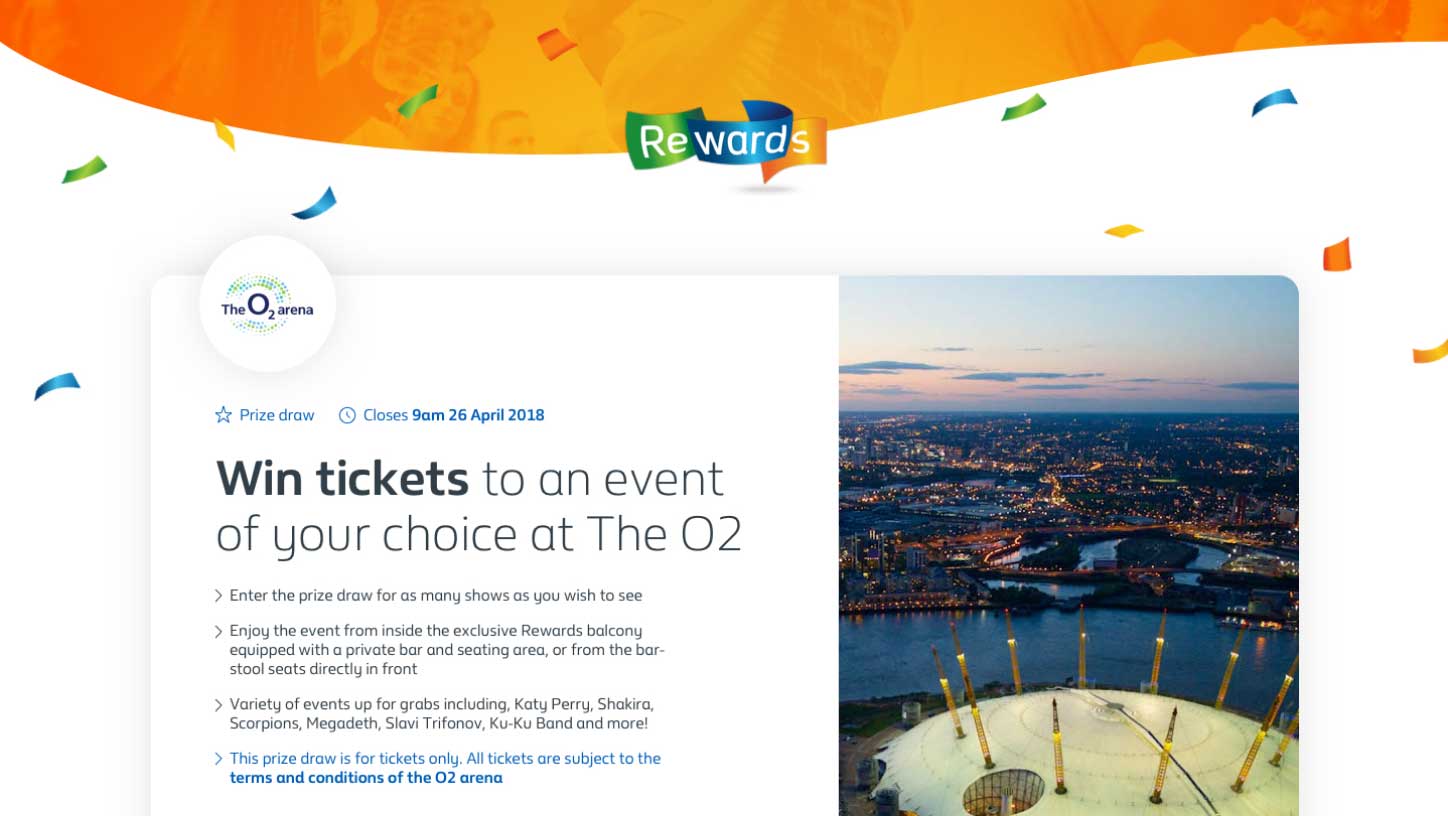
Once we were confident that our ideas were going to resonate with customers it was time to add fidelity and bring our designs to life. At the time, British Gas were in the process of implementing a new digital design system which made our project a perfect candidate to be the first to prove out the language.
The design is energetic, fun, contemporary & colourful so that our customers feel a sense of escape from an otherwise functional energy service. We used several photographs in various parts of the canvas that not only added depth to the design but showed our existing customers enjoying the rewards that they've redeemed.
The results
8.2%
New registrations from both new and existing members rapidly increased due to our improvements.
18.8%
Our offers and rewards were truly irresistable once users had found the new dashboard.
£121K
Our new improvements drastically helped our revenue growth over a very short period of time.