Systemising design at Virgin Atlantic
Product design, product strategy, stakeholder management, user research, team buildingThe challenge
Create, govern and promote a digital design system that will guarantee a world-class user experience across our entire digital estate including the website, app, in-flight entertainment systems (the screens on the back of the seats), check-in kiosks and more.
It also needed to be scalable across our tech stack & easy to use for various parts of our business including our friends across the pond, Delta Airlines.
Establishing an approach
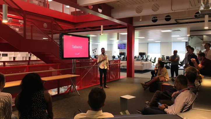
The project that we named, Tailwind, seemed like a perfect opportunity to use Clearleft’s project canvas which helped us define the why, what, who and how.
We focused our attention on designing and building a series of split tests for the web that would help us validate our work on a commercial level thus giving us the confidence from senior stakeholders that we’d need to move onto the next step of rolling this out across our digital estate.
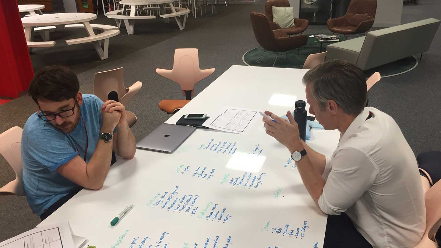
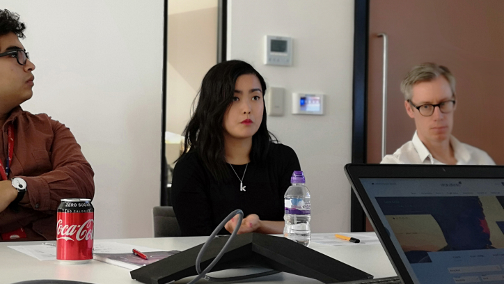
We broke down our creative exploration into 2 phases each containing four rounds of two-week sprints. Each sprint contained the usual ceremonies including planning, stand-ups and a review where we invited stakeholders from all over the business to contribute to our work and ensure that we were hitting the right notes from a brand & tonal perspective.
To help guide our phased discovery we used our customers’ golden path starting with the homepage, booking flow, manage booking & finally, the app & IFEs. Each part of that journey required us to carefully dial our brand personality up & down depending on the user intent. Functional pages needed to feel simple and transactional whereas the homepage was our chance to experiment with our personality.
After every bi-weekly review, new components would be approved & added to our library for the team to use in the next sprint.
Planning for scale
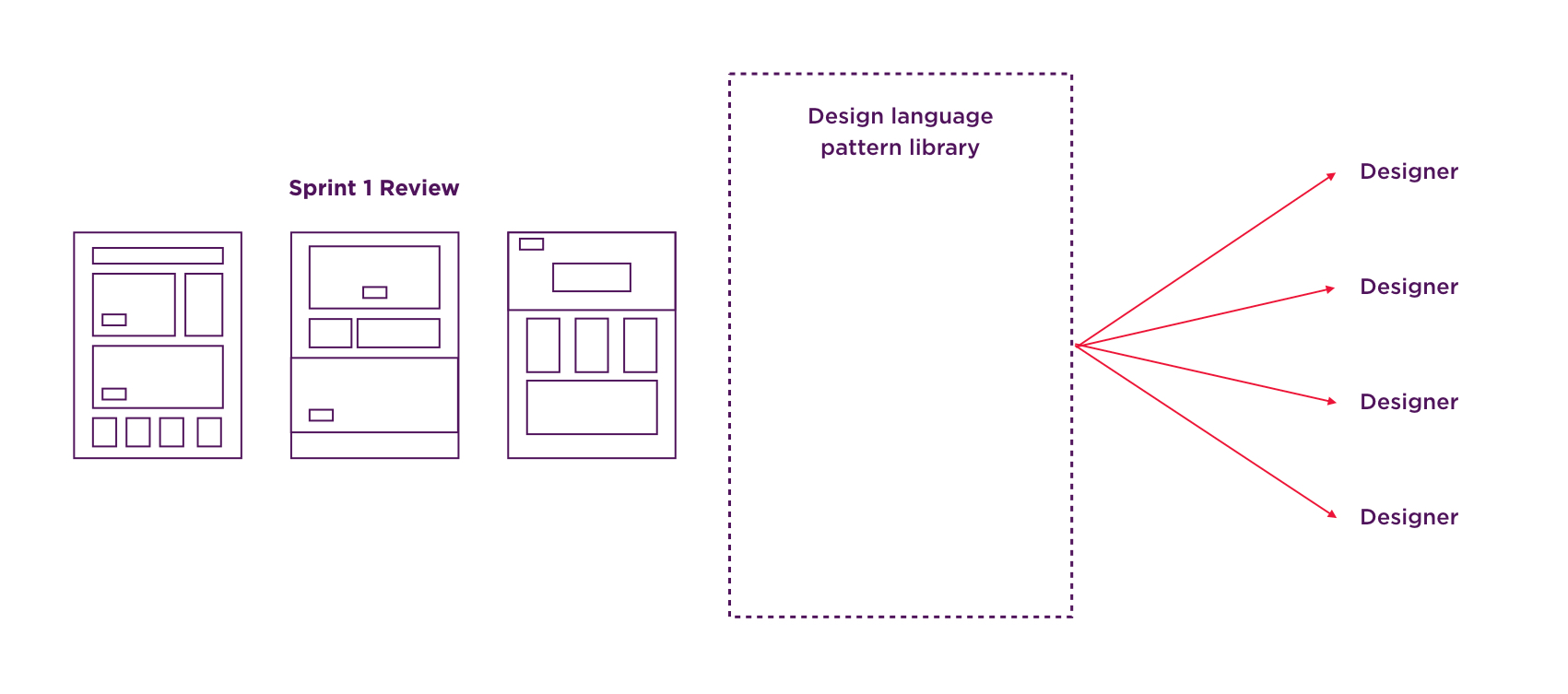
Storybook seemed like the obvious choice to host the front end of our components. This would serve as a single source of truth for how our components should be styled. What’s more, Storybook integrates seamlessly with Figma (our design tool of choice) and ZeroHeight (where we’d keep our digital style guide).
The frontend codebase would be version controlled using Github where we’d package everything into a single repo ready to clone and use for third parties.
Understanding the landscape
Once we had established an approach for Tailwind it was important to reach out to various parts of the business and understand their expectations for what we were trying to achieve.
As a project, it was an easy sell, we needed a consistent and quality user experience across our digital estate and creating a design system was the obvious answer. However, what we didn’t yet understand was how our senior stakeholders felt about the current web experience and what their desired web experience would feel like.
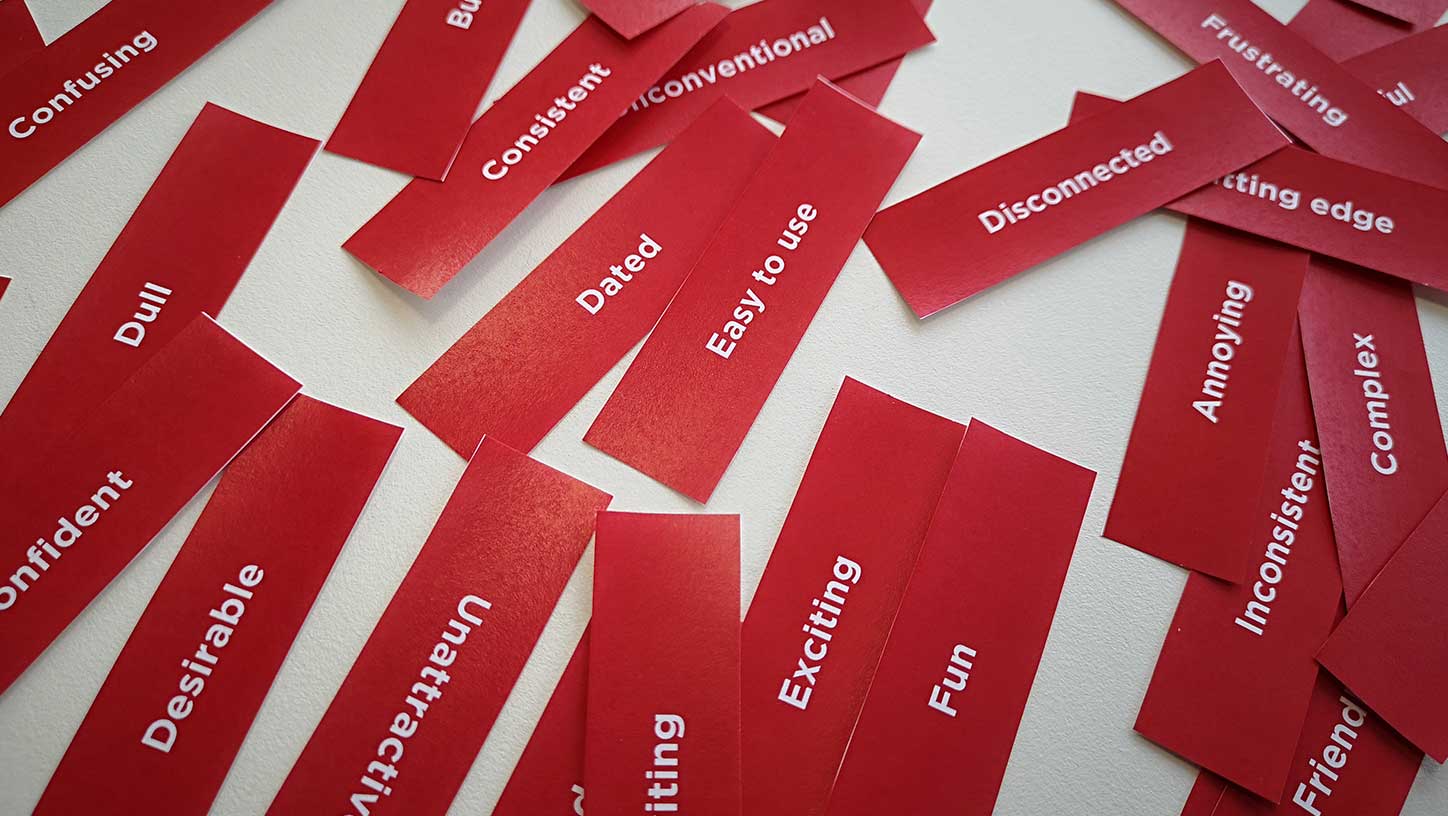
To help gauge those expectations we conducted several desirability tests. We asked each of our senior stakeholders to pick three words from a list that they felt best described the current web experience followed by the same list of words being used to describe their desired web experience.
Benchmarking the current web experience with our customers
Simultaneously, we ran the same desirability tests with a group of customers asking them to pick three words to best describe the current web experience.
In time, once we were confident in our creative direction, we’d repeat the same test using our new design system. We’d then compare those results against the desired outcomes of our senior stakeholders confirming that we had met their requirements.
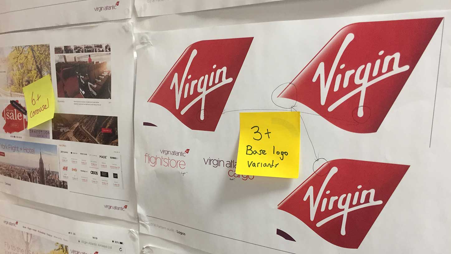
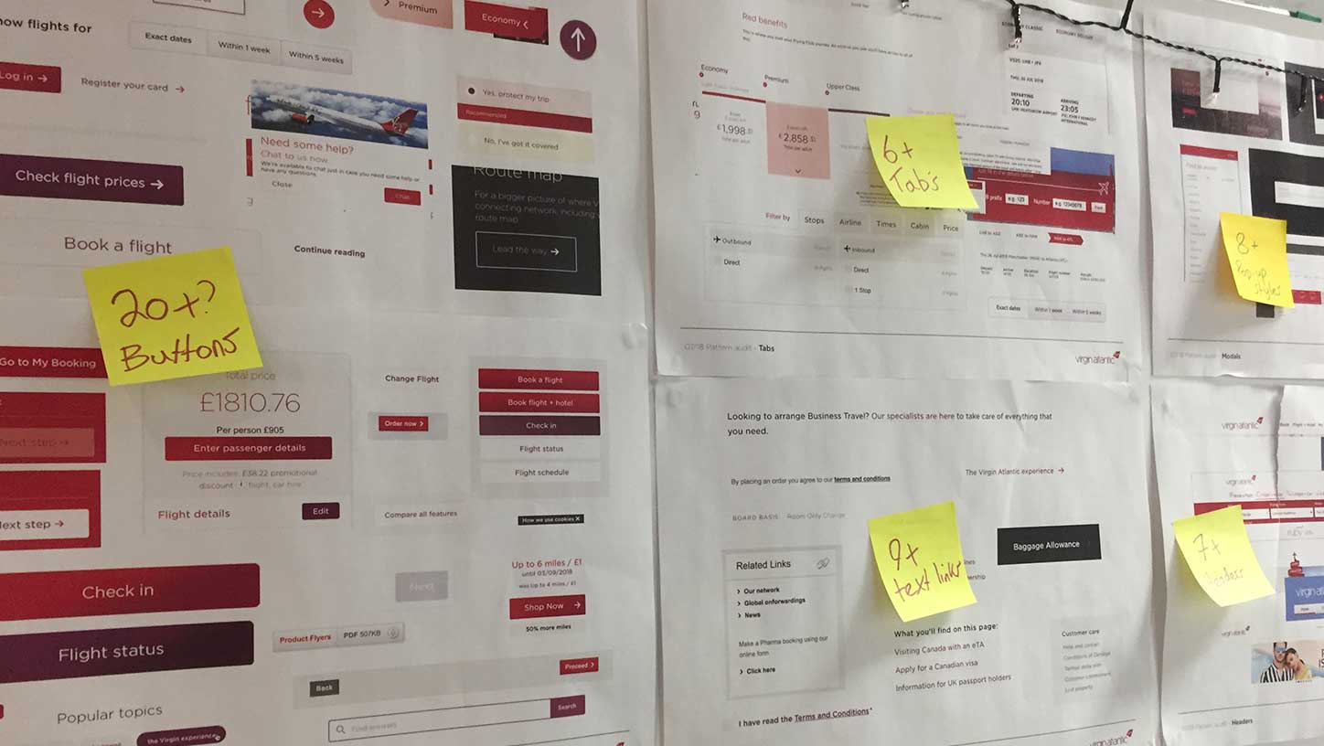
Audit of existing components
We needed to understand the breadth & variation of components that were currently being used across our digital estate.
We took a few days to carefully groom every screen on every platform and document everything we came across. We then printed this out, put it up on the wall and began devising a list of all of the components we thought we’d need to re-design.
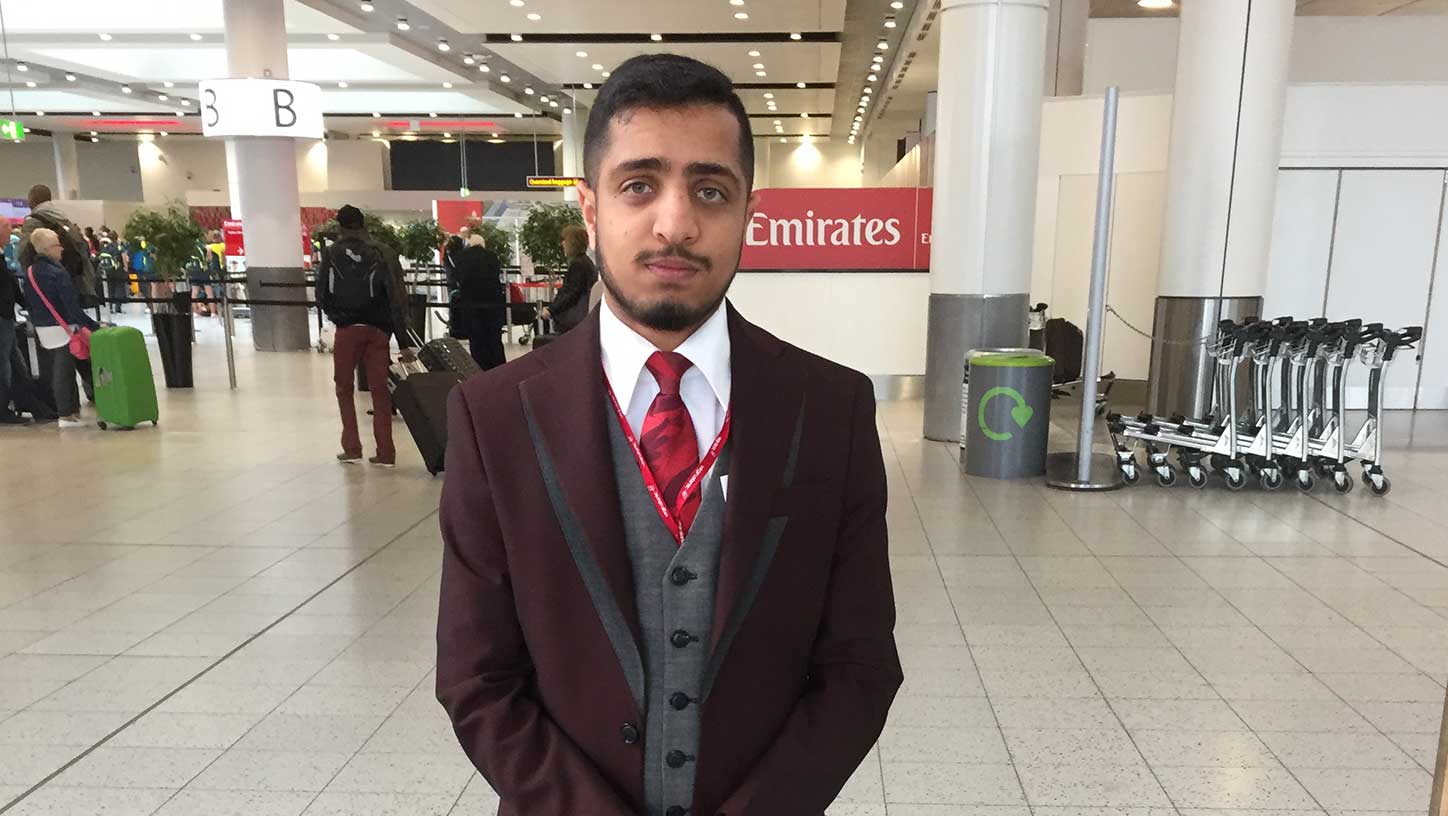
Visit our Gatwick & Heathrow terminals
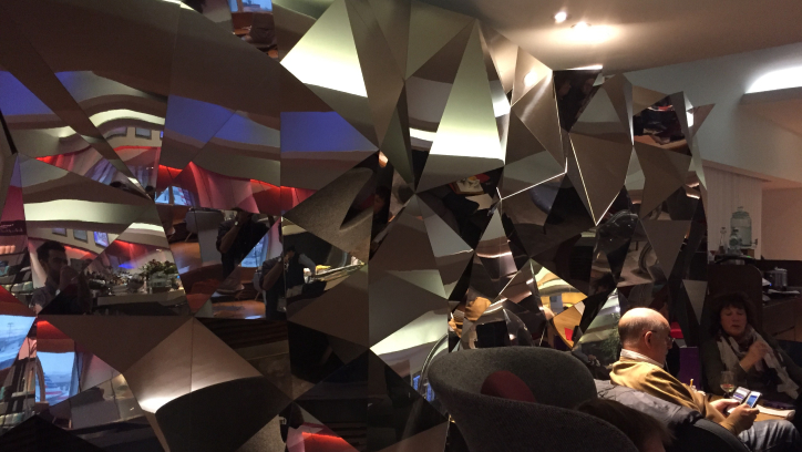
The Virgin Atlantic brand doesn’t just stop at our website, it covers so many more touchpoints in the customer journey including our airports, planes, uniforms, check-in kiosks, help desks and more.
I wanted my team and I to see this for ourselves and look for inspiration in the physical space as well as talking to customers who experience our brand in a completely different way to us.
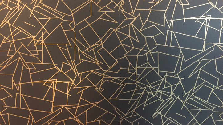
We found some beautiful textures, colours and shapes that we could take away and use in our exploration.
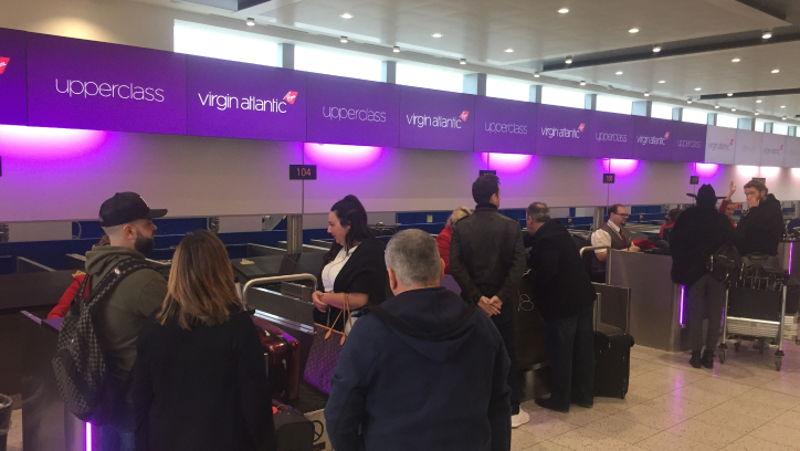
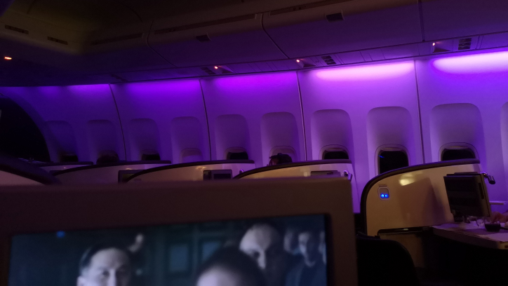
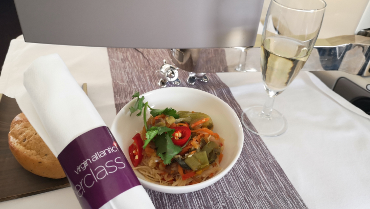
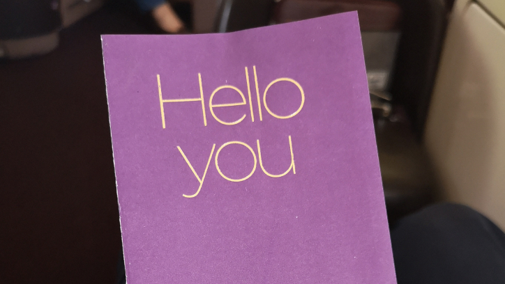
Experience a Virgin Atlantic flight
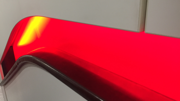
I hadn’t flown with Virgin Atlantic before and I was intrigued to see how our brand was represented on our infamous onboard experience and I wasn’t disappointed!
The reds and purples that our business is so recognised for were prevalent throughout the interior of the plane as well as the onboard entertainment systems & menus.
It was clear that it’d be fruitless to create a new colour palette as part of our work on Tailwind. Instead, we needed to devise new and innovative ways to use the existing colours on the canvas together that would still embody our brand appropriately.
Setting the creative tone
It’s hard to determine where to start creatively for a project of this magnitude.
So, we thought it’d be prudent to try and set the artistic tone and discuss other companies & products that we could use for inspiration. Through the business stakeholder interviews that we’d conducted we were confident that Virgin Atlantic is and continues to be a luxurious, elegant, classy and quirky brand.
We analysed and documented examples from brands that we felt closely matched these characteristics which then helped give us a flavour for what we were trying to achieve creatively.
Discovery
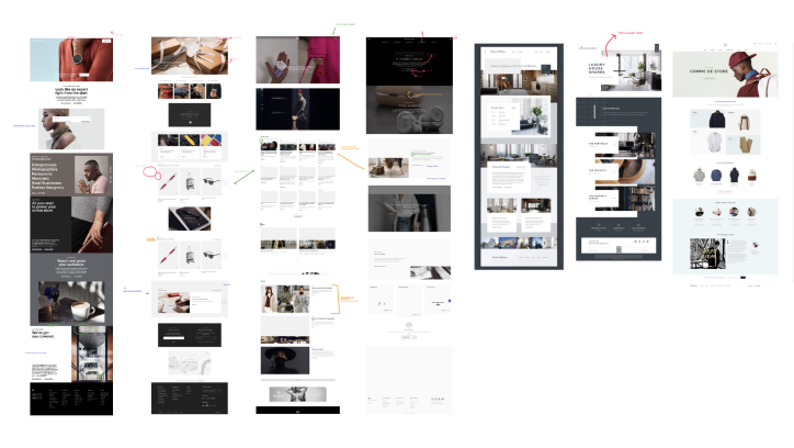
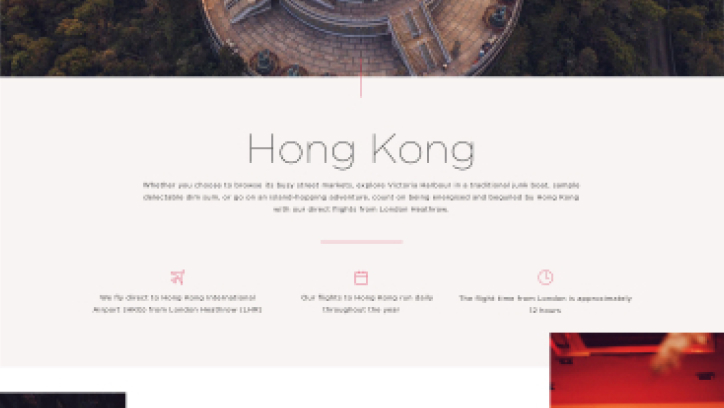
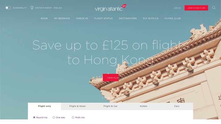
We started our discovery on the homepage where we felt we could dial our personality to 11 and be as adventurous as possible. We experimented with a lot of bold colours, fluid shapes and striking photography that resembled our TV campaign, “depart the every day”.
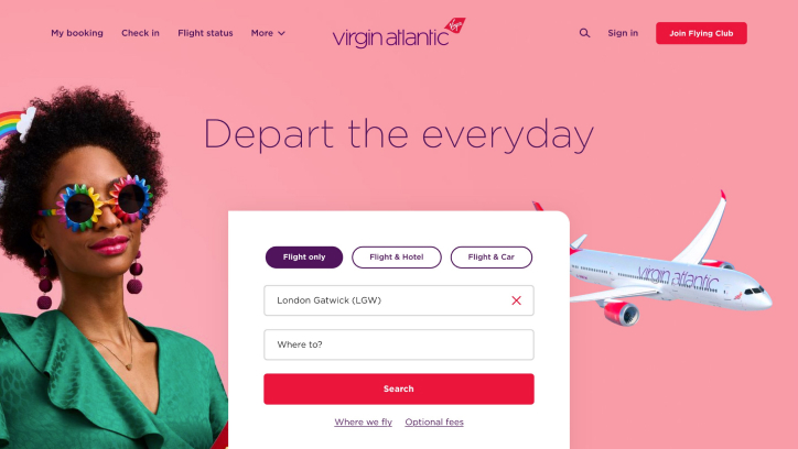
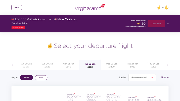
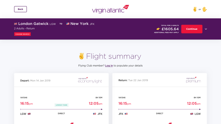
Although this aesthetic felt very fun and eye-catching, it lacked the luxuriousness & elegance that Virgin Atlantic is so famous for and was too closely aligned with our campaign artwork which was likely to change.
We went back to our research and tweaked our approach by using more white space, thinner type weights and more sophisticated photography. We also explored a number of unique visual devices that we could use to add depth to the page. Below are some of Kate Pierce’s ideas into how we could use the shape of our tailfin as a mask for destination photography.

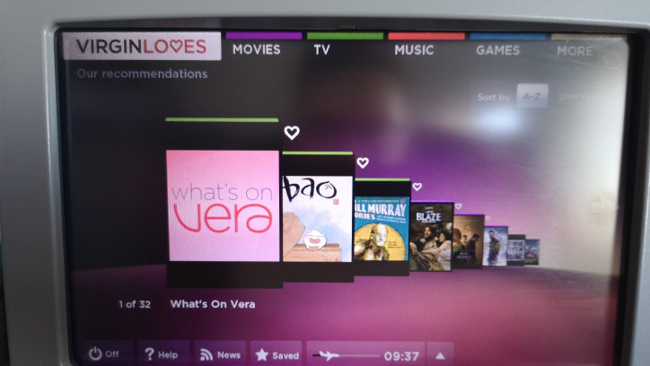
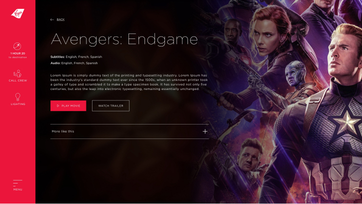
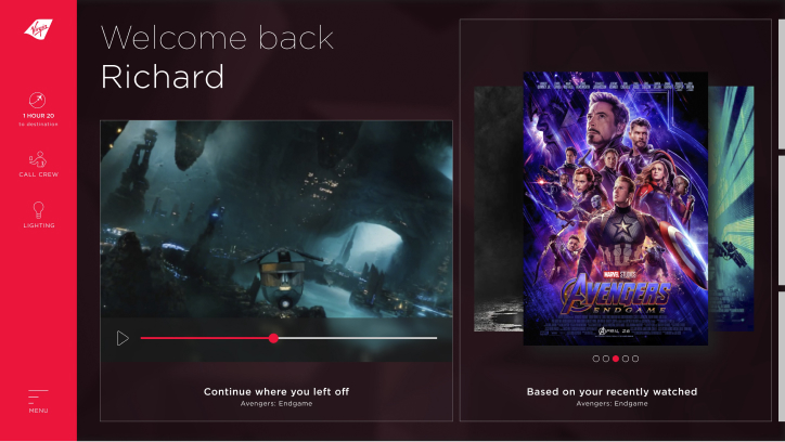
Once we began to gain confidence in our work we then broadened our discovery to our app and IFEs (in-flight entertainment systems) in order to understand how Tailwind could scale to other parts of our digital estate.
We purposefully wanted to emphasize the use of red on the canvas and although it can be a difficult colour to work with, when it’s done right it can help reinforce the character of our brand. After all, when people think of Virgin, they think of red!
The end result
After five months we had completed our creative discovery and had landed on an aesthetic we were happy & proud of.
Together, we had created over 200 components that personified the chic, stylized & elegant aspects of the Virgin Atlantic brand and would give us the tools we needed to design for scale.
Validating our concepts
Now it was time to revisit our desirability tests and verify that what we had designed met the desired outcomes & requirements of our senior stakeholders.
We conducted several desirability tests and documented our data using AirTable. The three most popular words used to describe our newly designed experience were, clear, elegant & classy. We were happy that those results met the requirements of our senior stakeholders and we were able to move onto the next stage of the project.
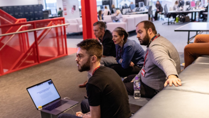
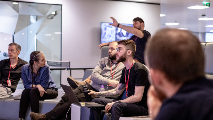
Fun & purposeful reviews
Throughout the project we ran a total of about 8 sprint reviews with stakeholders from all over the company and as you can imagine it can be tough motivating people to keep coming back every two weeks!
Here are a few things we tried to help make the reviews as engaging as possible:
- Sharing a recap of what we covered in the last sprint and what we were trying to achieve in the current one.
- Regularly sharing our overall project progress.
- Sending an email reminder a day or two before the review.
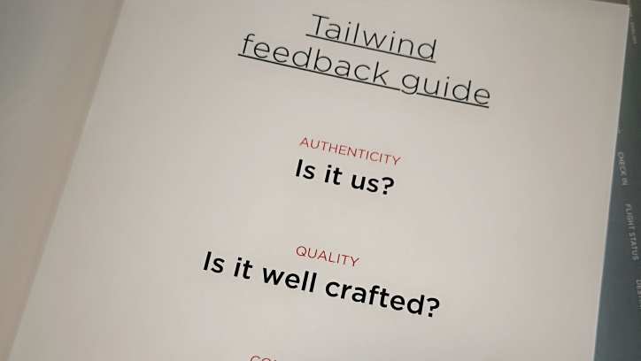
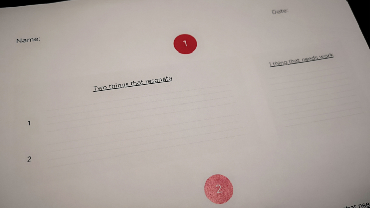
- Providing feedback guides.
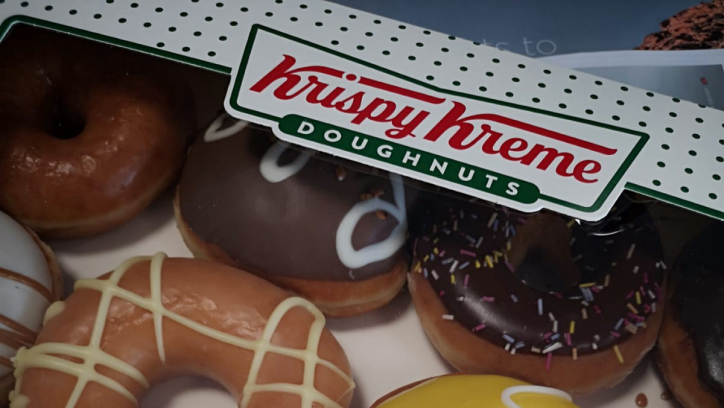
- Doughnuts!
Setting clear guidelines for feedback
Throughout the creative discovery, it was often tough to ensure that everyone in the room had a voice and that the feedback they shared during reviews was objective & helpful.
At the time, I had just attended the Adobe Summit in Las Vegas where I listened to an inspiring talk by Collin Whitehead, the Head of Brand Studio at Dropbox. He described similar frustrations in Dropbox’s journey in creating a design system and explained how they utilized strict feedback guidelines to move the conversation from subjectivity to objectivity.
Alongside four guiding principles of giving feedback, Collin and his team also made a concerted effort to get the people in the room to write their feedback down. Doing so meant that Collin’s team had an audit trail of feedback that they could reference which also, coincidentally, encouraged those stakeholders to better consider the feedback they were giving.
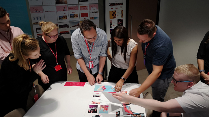
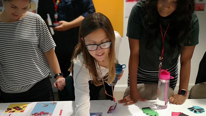
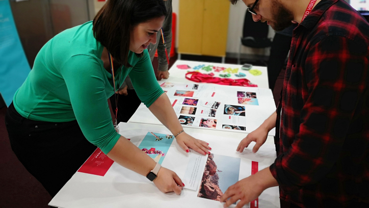
Showcasing our work
It was time to showcase our journey to everyone at Virgin Atlantic and make people feel a part of what we were trying to achieve.
We conducted several showcases for departments across the company showing them our creative process and our end results.
We curated a gallery of concepts around the room as well as a collaborative exercise where our colleagues could build their own web pages using cut out components from our new, Tailwind design system. It was a fun way to show how the Tailwind design system will help guarantee a quality & consistent digital experience in the future.
Mission success!
Defining the test
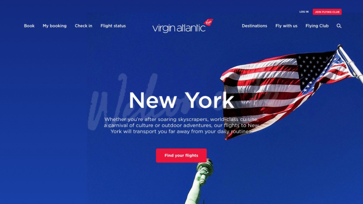
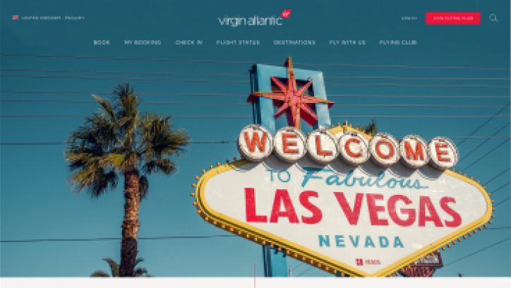
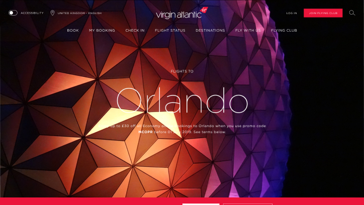
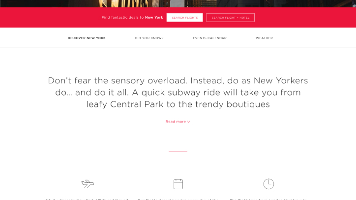
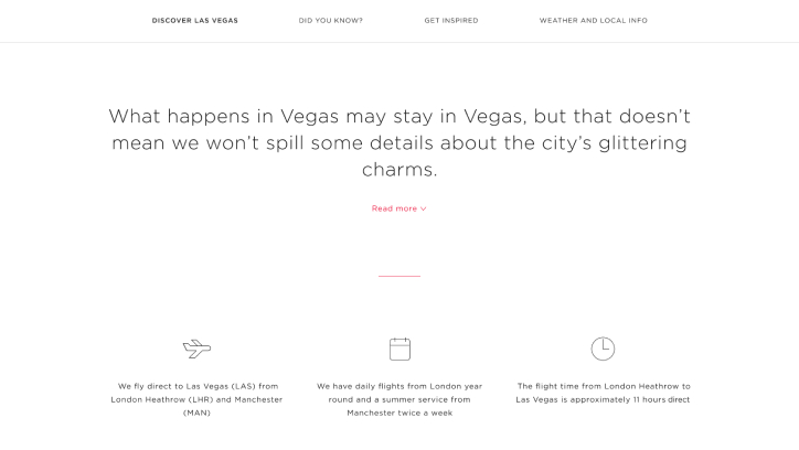
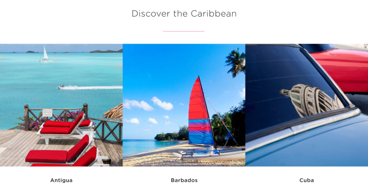
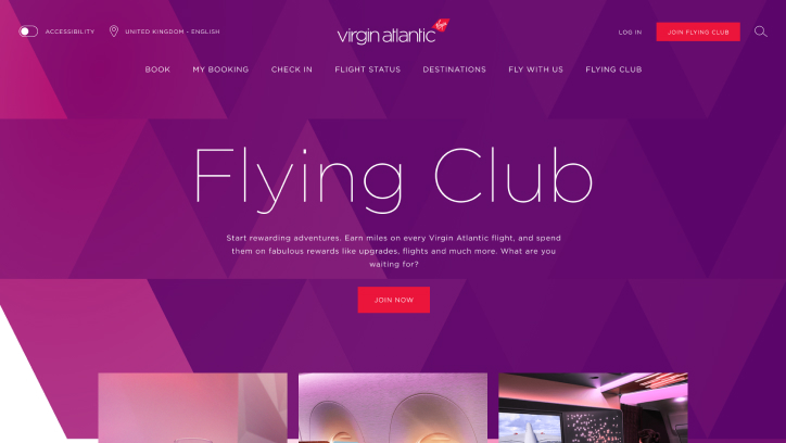
Together with the data & insight team, we decided to split test five pages across our website. Four destination pages (New York, Orlando, Las Vegas & Caribbean) and the Flying Club homepage. Each of these pages carried enough traffic & commercial significance to give us the confidence we needed in Tailwind.
We tested for six weeks on the UK website to 50% of total traffic (outside of sale period).
Measures of success
The measures of success varied between the destination pages and flying club homepage.
The destination pages sit at the top of our conversion funnel so we tracked clicks into our shop & book flow as well as click depth. The more clicks we had on the page followed by a purchase meant that customers were engaging with our content and making a more considered decision about their chosen destination.
The Flying Club homepage serves as a gateway for our customers to join our loyalty program so we tracked the number of FC registrations as well as the time on page. A lower amount of time on the page resulting in registration would tell us that our new design system did a better job of exciting our customers into joining.
What next?
Our analysis will ensue once the split tests are complete. At that point, we’ll determine the level of confidence in Tailwind and decide whether we need to conduct any further validation before we start the rollout across our digital estate.
Watch this space!